Kestral's Attempt to Make You Go Wow
There's a LOT more than what meets the eye to make this site.
To begin with, there isn't something that comes out of the PhpBB package that sets up the general header we see at the top. I would be thrown off by that in the beginning.
You also have to consider how much work is done. I'll point everything in a normal character page.
I'll use this as an example.
Already we have lot's of tables conveniently set up. Tables. Conveniently. Spacing, padding, are of the tags, and so on.
BUT THEY AREN'T TABLES.
Oh, ho, ho. You see, everything on the left side technically isn't a table. It's one whole background image with text. It still takes padding, spacing, and such.
Something that isn't easy for someone who just picks up CSS or HTML and styles away. (I have trouble making borders! Image borders.)
The Style type tables (and/or divs) are made easily if you have access to PhpBB's source HTML. But the Coins lighting up are a neat effect that may take a bit to get around.
Now, I'd like to point out the devilishly simplicity of the meat of the page. The stats. As you can see, the table looks good.
But wait, it isn't a table. It's another image!
Some may be able to right click on it, and select "View Background Image". Simple. I know I wouldn't think of that at first. (Those bars, are static. :p)
See the tabs at the bottom? Yeah, that's kinda intricate.
Keep in mind: Skills, Factions, and Stats, and the blue text.
First, see the scroll bar? Fancy. I think I've learned how to do it once, but never tried. But still looks good to me. They all use the same Background Image, too.
Secondly, see the convenient icons? Start up Oblivion, and try to rip every single icon used here. Go, now.
Back? See how very tedious that is?
Now, my favorite part, the text.
It may seem simple, type. Oh, ho, ho, ho!
Select it. View image. What do we get? An image!
http://www.elderstats.com/character/S1/ ... elector=h2 (Blue Text)
http://www.elderstats.com/character/S3/ ... elector=h2 (Brown Text)
Yes, an image... Not really, though. The image is created. Created by the script in the file. I can't wrap my mind around how Tom did it (With the help of Xavier, of course, who probably made the looks. Well, re-created it.)
I'm not done with everything, but this is just a small tid-bit of what Tom and Xavier had to do to make this place.
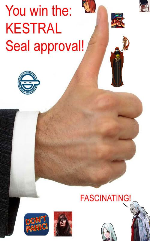
I give both, Tom and Xavier, my seal of Approval!
http://i266.photobucket.com/albums/ii26 ... 1245359101
Not that you really need approval. Consider it an award. :o
To begin with, there isn't something that comes out of the PhpBB package that sets up the general header we see at the top. I would be thrown off by that in the beginning.
You also have to consider how much work is done. I'll point everything in a normal character page.
I'll use this as an example.
Already we have lot's of tables conveniently set up. Tables. Conveniently. Spacing, padding, are of the tags, and so on.
BUT THEY AREN'T TABLES.
Oh, ho, ho. You see, everything on the left side technically isn't a table. It's one whole background image with text. It still takes padding, spacing, and such.
Something that isn't easy for someone who just picks up CSS or HTML and styles away. (I have trouble making borders! Image borders.)
The Style type tables (and/or divs) are made easily if you have access to PhpBB's source HTML. But the Coins lighting up are a neat effect that may take a bit to get around.
Now, I'd like to point out the devilishly simplicity of the meat of the page. The stats. As you can see, the table looks good.
But wait, it isn't a table. It's another image!
Some may be able to right click on it, and select "View Background Image". Simple. I know I wouldn't think of that at first. (Those bars, are static. :p)
See the tabs at the bottom? Yeah, that's kinda intricate.
Keep in mind: Skills, Factions, and Stats, and the blue text.
First, see the scroll bar? Fancy. I think I've learned how to do it once, but never tried. But still looks good to me. They all use the same Background Image, too.
Secondly, see the convenient icons? Start up Oblivion, and try to rip every single icon used here. Go, now.
Back? See how very tedious that is?
Now, my favorite part, the text.
It may seem simple, type. Oh, ho, ho, ho!
Select it. View image. What do we get? An image!
http://www.elderstats.com/character/S1/ ... elector=h2 (Blue Text)
http://www.elderstats.com/character/S3/ ... elector=h2 (Brown Text)
Yes, an image... Not really, though. The image is created. Created by the script in the file. I can't wrap my mind around how Tom did it (With the help of Xavier, of course, who probably made the looks. Well, re-created it.)
I'm not done with everything, but this is just a small tid-bit of what Tom and Xavier had to do to make this place.
I give both, Tom and Xavier, my seal of Approval!
http://i266.photobucket.com/albums/ii26 ... 1245359101
Not that you really need approval. Consider it an award. :o